A cover is worth way more than a thousand words
“Don’t judge a book by its cover!” — said no book designer ever.
Phew. I’ve finally been able to go into a bookstore after not doing so for over 18 months! The feeling was overwhelming; it felt like coming home after a long vacation. I was like a kid in a candy store, taking in all the sights, the scents, the atmosphere — nothing compares to that feeling. (Not even a bagel shop on a Sunday morning.)
My eyes were darting from table to shelf, back to table. Most titles and covers were familiar, but my brain was on overload being able to actually see and touch the books. All. The. Books. And all the beautiful covers!
Oh, the delight of beautiful book covers. One cannot pass those by without picking them up and marvelling at them up close before turning them over to read the synopsis.
Book cover design has become somewhat of a science. These days, authors, and especially publishers, invest a lot of thought, time, and money into what a book looks like. Specifically in this digital age, our eyes play such an important role in the decision-making process. They are a portal into our minds, the same way the smell of coffee beans wafting through the air is in a coffee shop.
Not to minimize the importance and impact of a storyline or writing style, but a book cover is used as an attraction method, namely in stores. Which is why publishers are actually often asked by big box stores, or booksellers, to change covers at the very last minute. (I know, I was shocked too.)
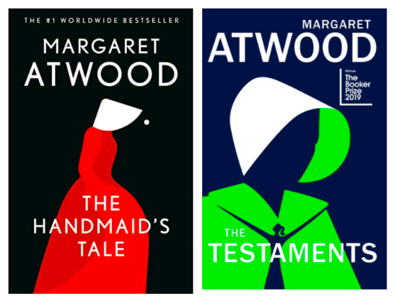
Sellers use sales tactics such as (the obvious) laying gorgeous books on tables so that the front cover is exposed, or displaying a book face out on a shelf instead of the usual spine out method. It’s easy to see how this would work when you consider covers like these:
Of course, art is subjective, and publishers have found ways to attract different demographics; for instance, North American covers vary from UK or European covers according to general tastes/style of said demographic, and so elements like colours, brightness, font and image size differ greatly. The discrepancies range on a scale from “subtle” to “how can this be the same book?”
Book covers can also be used as a familiarity tool in order for readers to be able to identify books written by the same author, or as part of a series that will share similar artistic motifs:
Some covers are a book’s calling card. When you’re so familiar with a book, you can spot it from across the room (am I right?). These iconic covers change sometimes over time to suit a certain market, or to “evolve with the times, ” but only subtly. Why? Because they’re practically considered a character, so changing them would take away from the story’s authenticity.
An additional tool used in book cover design: trends. A very popular trend in the last few years has been illustrated book covers. Used mostly for rom-coms or YA books, these illustrations are simple, with clean lines coupled with bright and attractive colour combinations.
Another fashionable cover fad that has been commonly used lately, mostly in historical fiction, is the image of a woman facing away or walking towards an artistic background associated directly with the story.
A book has an infinite lifetime through ongoing publication and reissues. Unless stated in the copyright notice inside the book, it becomes public domain 70 years after the death of its author. Many publishing groups take advantage of this and reissue classic books. That’s why you might’ve seen dozens of reissues of Pride & Prejudice.
Some readers love collecting the different issues, and therefore (proudly) own many versions of the same book. Of course, this is a very profitable opportunity for the publishers and booksellers. Imagine having multiple copies of Anne of Green Gables by L. M. Montgomery — what a beautiful collection that would make!
Many years ago, when I was attending the University of Toronto, there was an independent bookstore around the corner from my department building. One afternoon, I walked over there with a fellow classmate, and when we got in, I noticed they had a small table filled with books...BUT they were individually wrapped with plain kraft paper, and each had 3-5 sentences written on them describing the book:
“Spirited 11-year-old red-haired orphan. Mistakenly sent to middle-aged siblings. They wanted a boy.”
That was it. That was how you chose that book. And you know what? Many places still do that with a few books! It’s a fun game to play with readers, with cover sight unseen.
I’m quite sure that I would make a different selection if I were faced with a choice of books in that way or those same books with their covers shown front and centre. It’s not a question of whether I would choose the book according to the synopsis — it’s a question of whether I’d pick up the book at all.
That’s the power of a cover. It’s not only what’s on the inside that counts.
What are some of your favourite book covers? Let us know here!
Written By: Maya B., Executive Editor.


